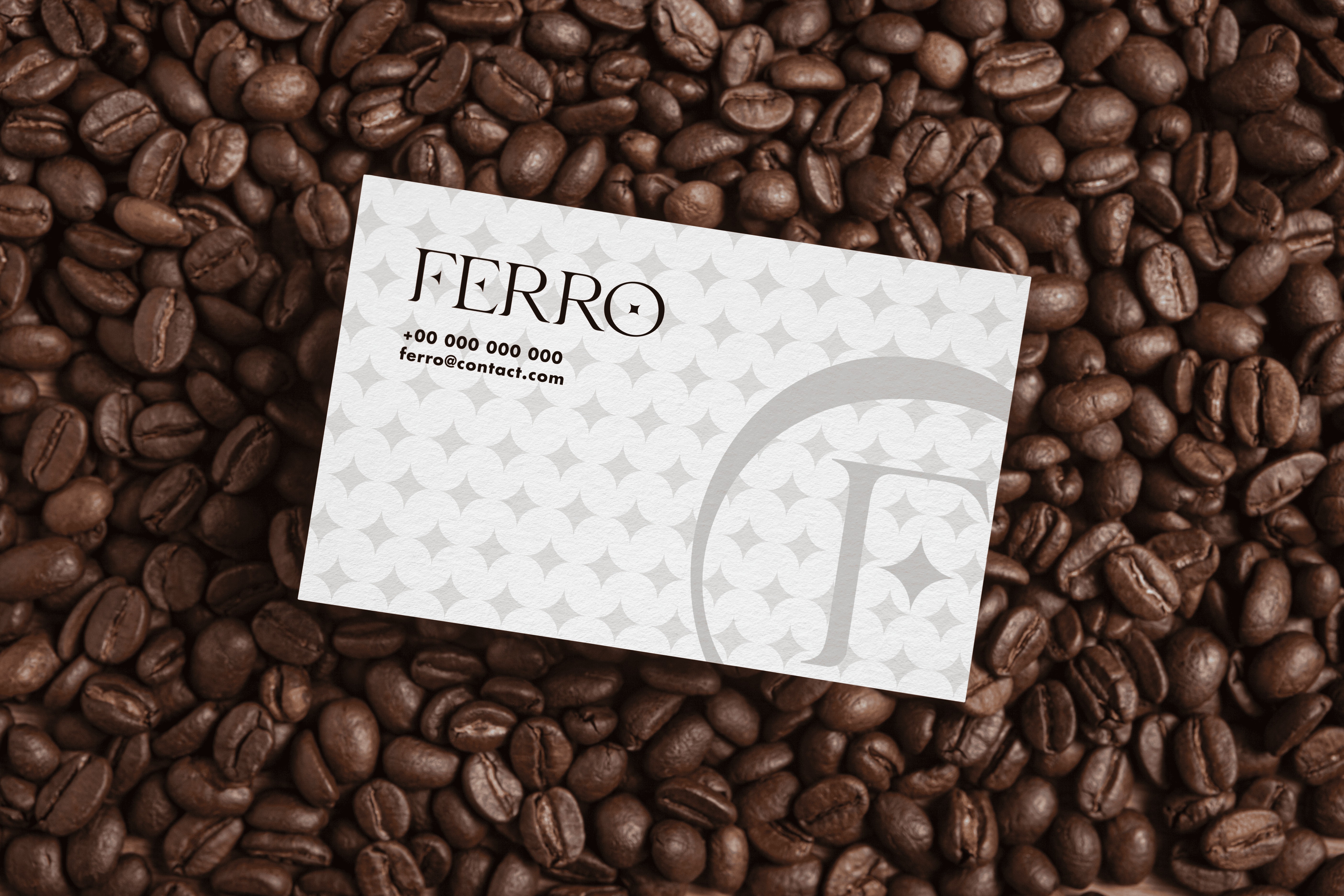
FERRO
Preview


DATE
20 Jan 2025
FERRO
Coffee
Brand Identity
Brand Strategy
UI/UX
By

Striker.Media
Short Description
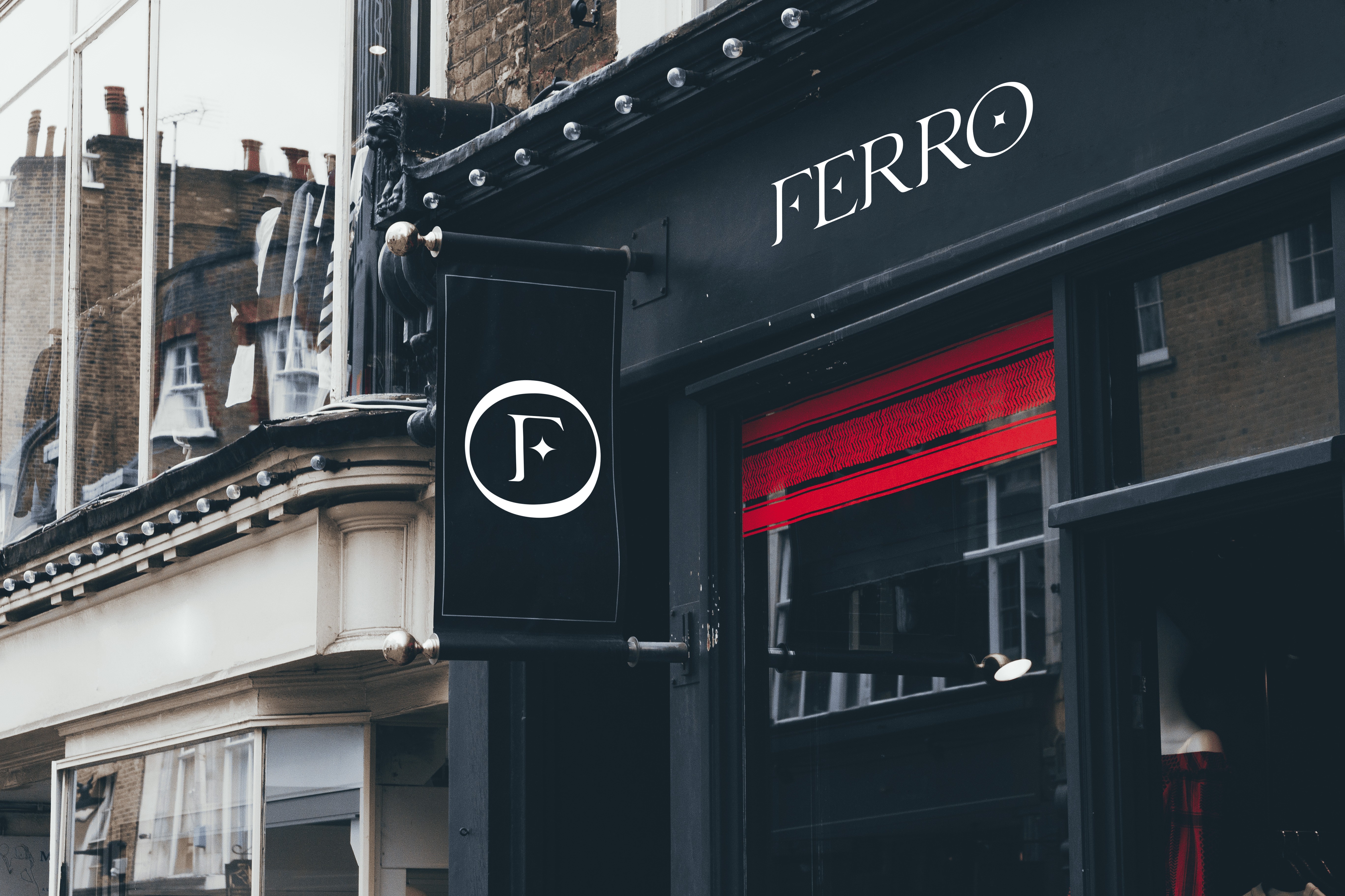
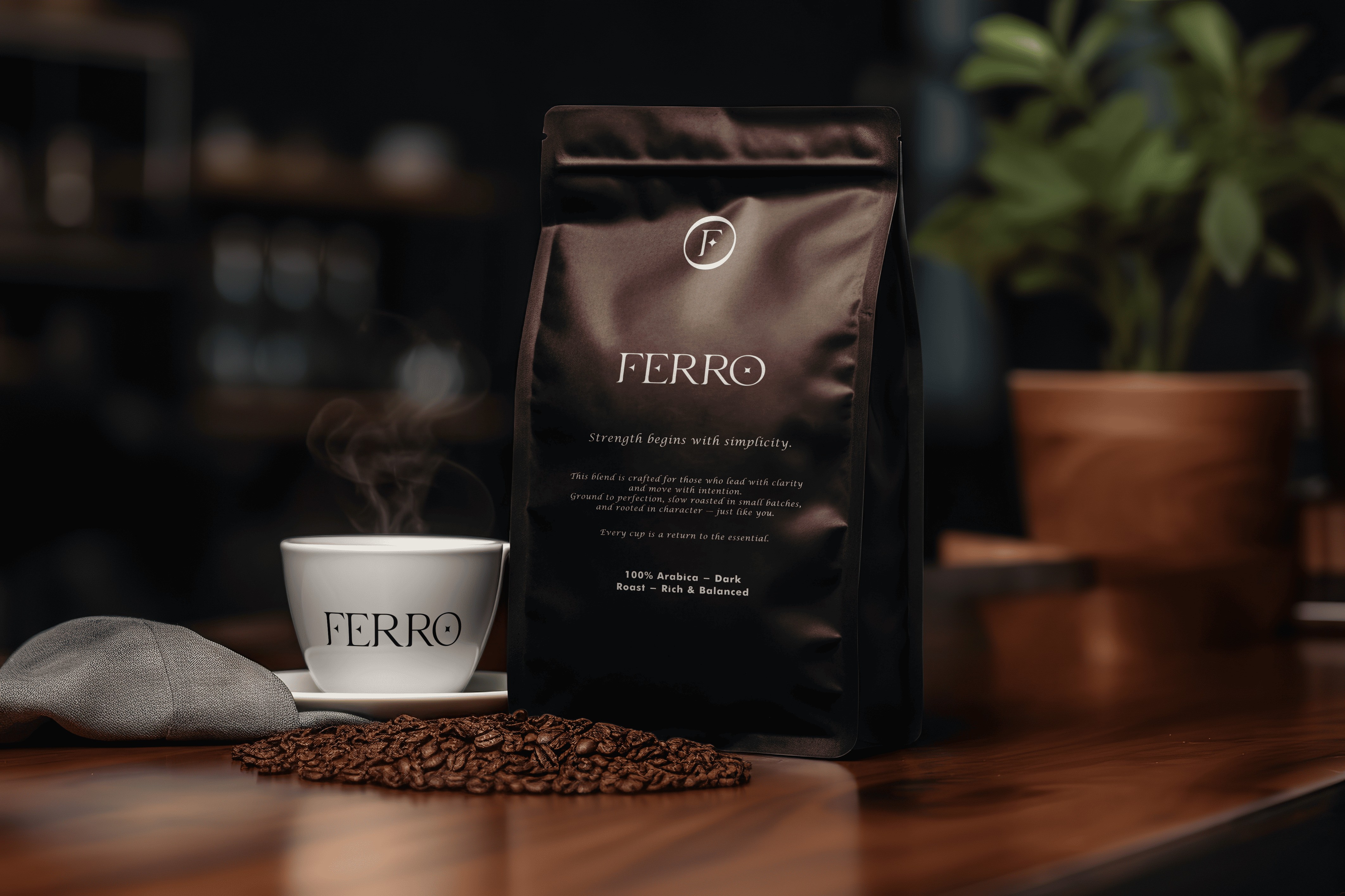
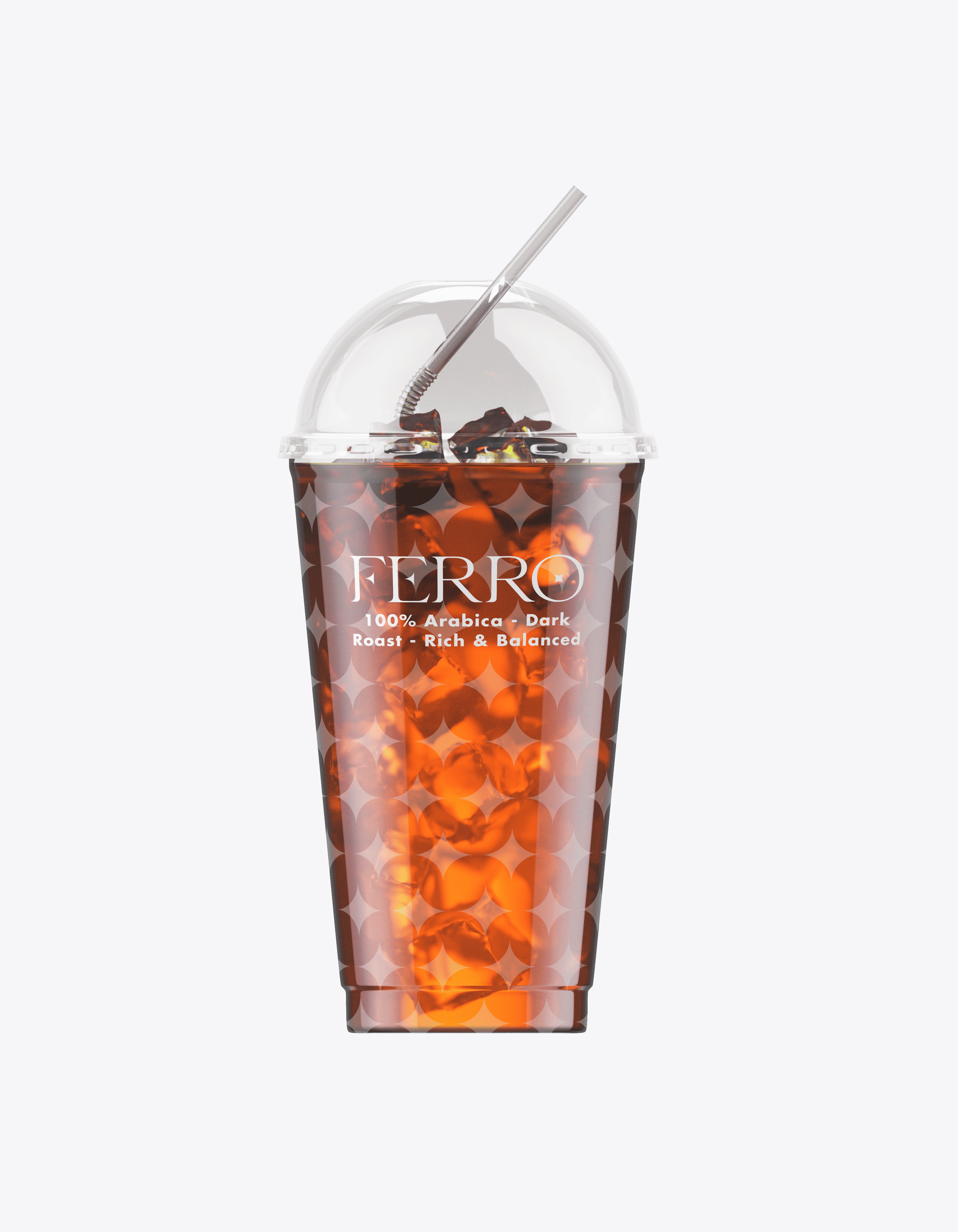
FERRO is a premium coffee brand with a refined identity that avoids clichés. It doesn’t rely on coffee beans or foam visuals. Instead, it uses a bold and minimal design that communicates quality and sophistication.
Our Goal
To create a modern and elegant visual identity that reflects the richness of coffee without using stereotypical imagery. The goal was to position FERRO as a high-end lifestyle brand through design alone.
Design Direction
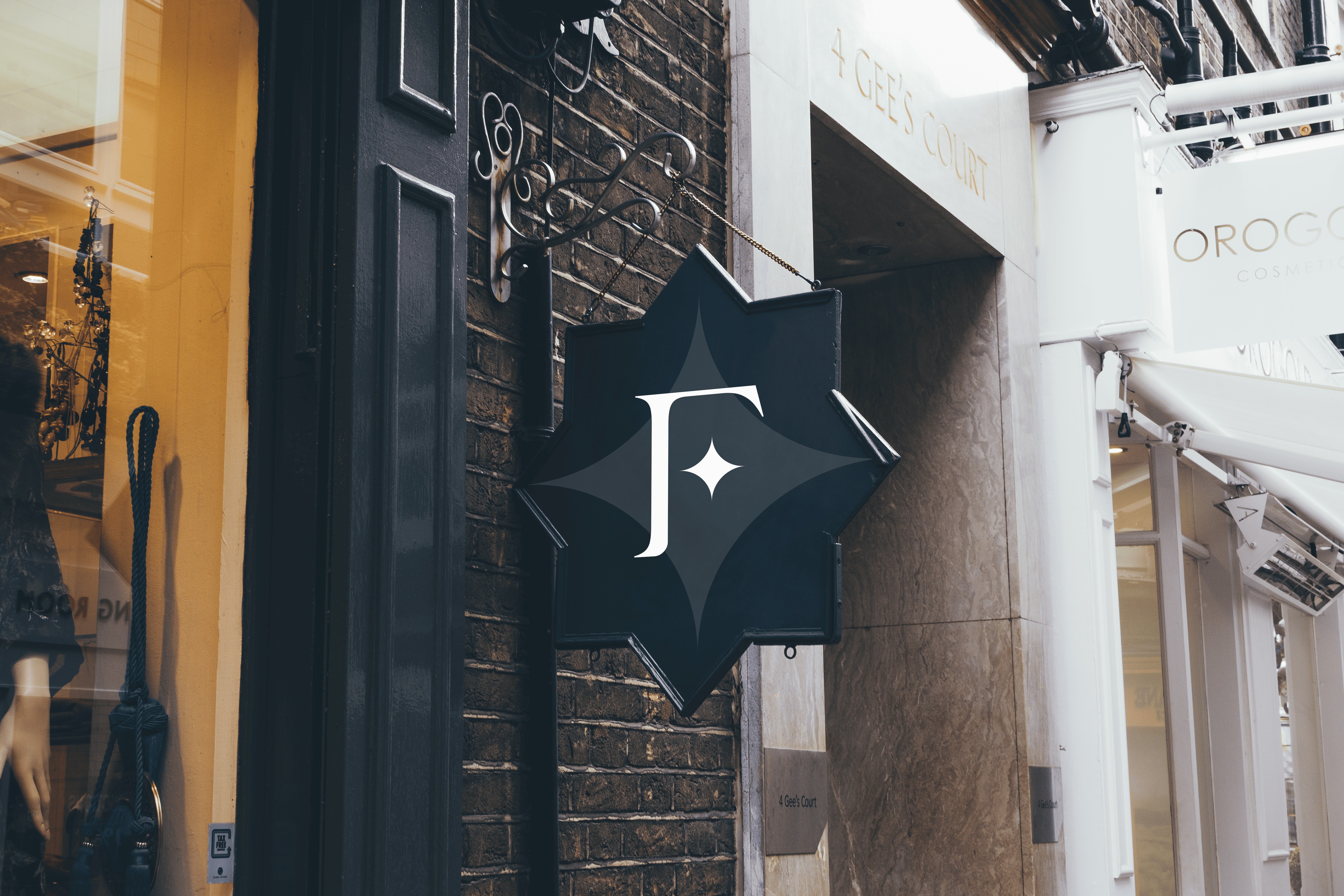
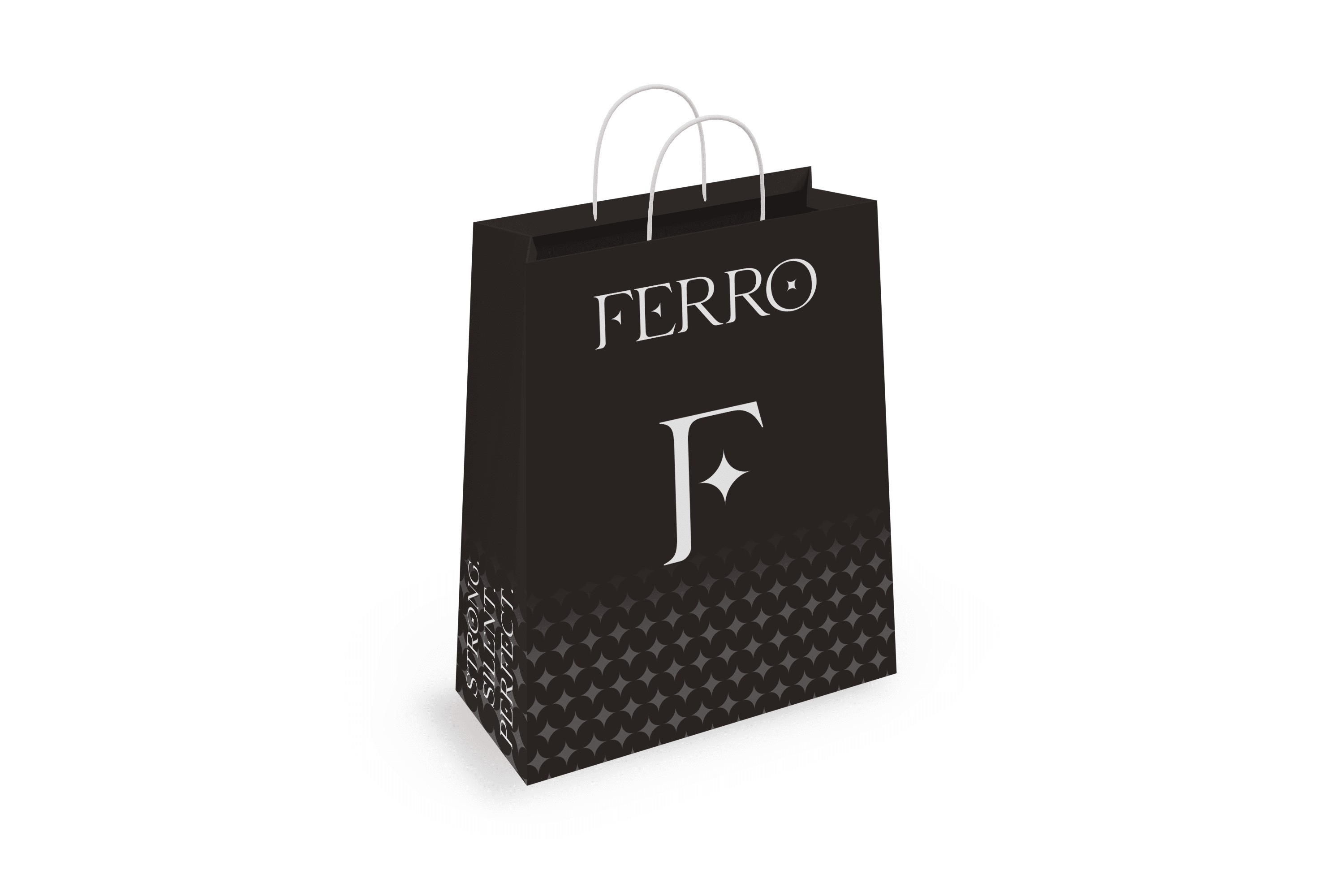
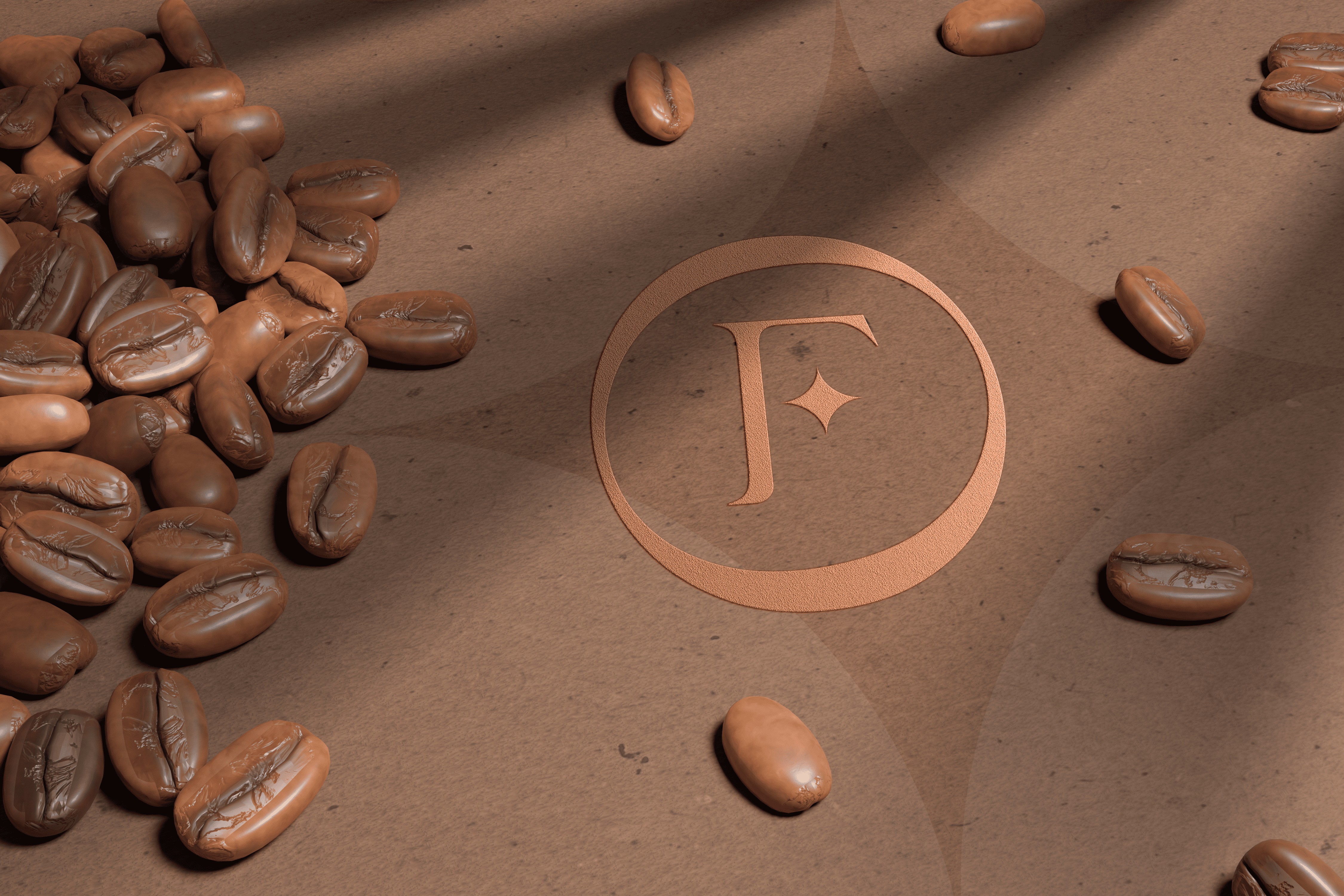
The identity is inspired by strength and subtlety. A warm palette of brown, green, and yellow evokes natural richness and energy. The clean forms and timeless typography build a visual presence that feels both confident and understated.
Outcome
FERRO’s brand identity works across digital, packaging, and print, delivering a consistent and premium experience that stands out through elegance and clarity.

